

About
Mission, vision, and story.
Kitchen-sink demo of sections and components commonly used on site pages. Use this as a reference when composing new pages.

Use BasicHero for simple page intros with optional subheader and button theming.
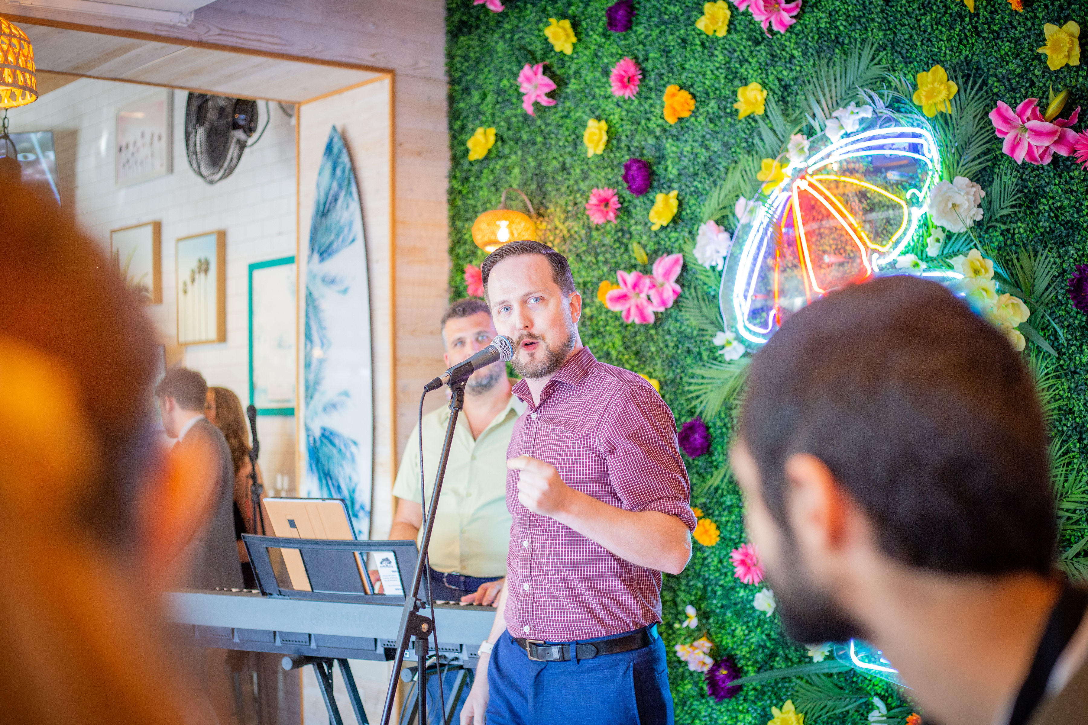
Use for a lead image with flexible text content. Great for About and Education pages.
Swap image sides, set max-width, and theme background/text colors using tokens or hex.

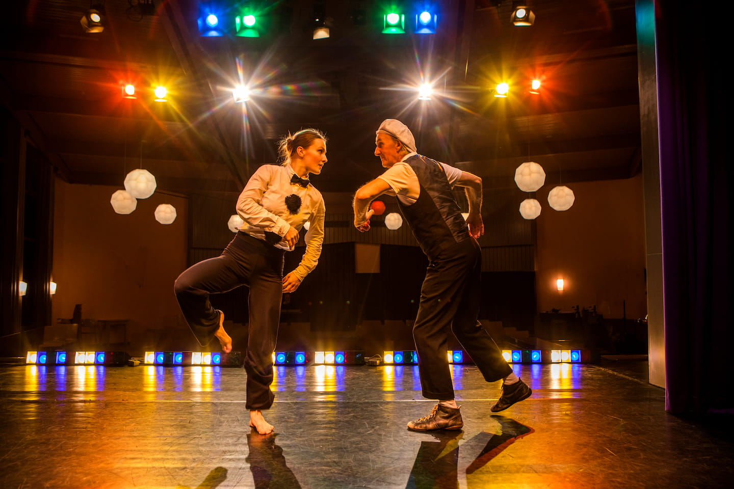
Swap image sides, set max-width, and theme background/text colors using tokens or hex.

Swap image sides, set max-width, and theme background/text colors using tokens or hex.

Any content can go here—buttons, links, or text.
Use predefined themes or your own utility classes.
Mix with other components for flexible layouts.
Guide visitors to events, donations, auditions, and newsletter.
Compose sections as needed: hero, grid, lists, FAQs.
Semantic headings, JSON-LD FAQ, and internal links.
Ready to dive in?
Fuel artist employment, education programs, and community partnerships so Savannah keeps a vibrant, sustainable theatre scene.